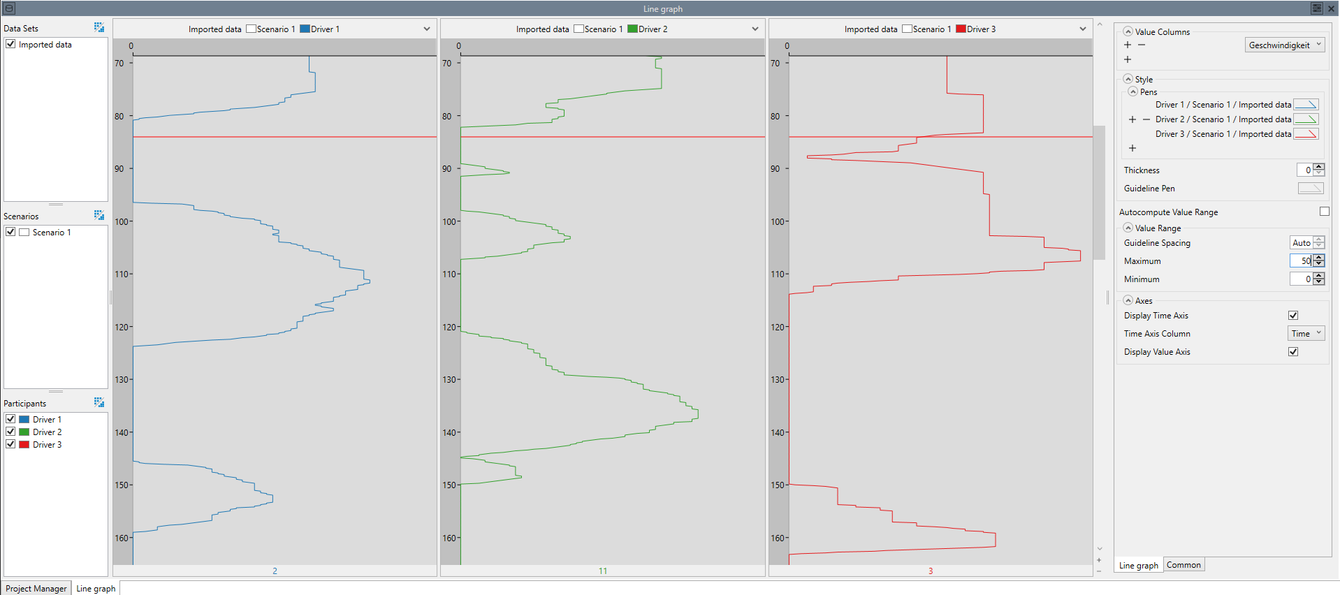
Line Graph
The line graph is a simple visualization that plots numeric values along a time axis.
Aggregation
Aggregating a line graph displays the graph of all participants and/or scenarios / data sets in the same window.
Settings
- Value Columns:
- The columns displayed as lines in the graph.
- Style:
- Parameters that determine the look of the visualization:
- Pens:
- The style used to draw the lines.
- Thickness:
- The thickness of the lines that are drawn. If the value is 0, the thickness of each line can be set individually in the pen dialog of each line. Otherwise this value overrides the individual values and can be used to quickly change all lines.
- Guideline Pen:
- The style used to draw the guidelines, i.e. the lines drawn at specific intervals.
- Autocompute Value Range:
- Automatically compute minimum, maximum and linespacing. This will ensure that the entire value range of the graph is visible.
- Value Range:
- Determines the range of values that is displayed. Disable Autocompute Value Range to enable these settings. This can be useful if you want to take a more detailed look at a specific value range, and the minimum / maximum values of the entire graph need not necessarily be visible. The value range consists of the following parameters:
- Minimum:
- The smallest value that is displayed. Values smaller than this minimum are cropped.
- Maximum:
- The largest value that is displayed. Values larger than this maximum are cropped.
- Guideline Spacing:
- The distance between two guidelines. This value is restricted by the Maximum and Minimum settings, because not too many guidelines can be drawn at once.
- Axes:
- The parameters that influence the display of axes:
